Designing a Child’s Room

by Constance Helstosky
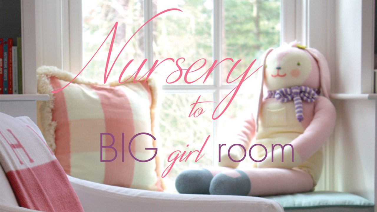
Designing a child’s room can be a unique, yet fun challenge. As every parent knows, the time of childhood is fleeting. A sweet baby grows into a “big kid” with even bigger ideas within the blink of an eye. Children outgrow clothes and likes quicker than mom and dad can keep track of, and that leaves some major questions for parents to be designing the space that their child will grow in. Luckily, interior designer Abby Harding of Harding & Co. Design has some wonderful tips and ideas to make the creation of a space for the special child in your life a little easier. Showcased by the beautiful nursery to “big girl” room, Abby elegantly created two beautiful spaces for one lucky little girl. The whimsical and traditional combine brilliantly to create a livable space that will grow and evolve with the child.

How the homeowner is going to live in and interact with their space is a primary focus for the design process. Designing a nursery or child’s room is no different. Every person is an individual and their room can be a refuge and sanctuary that provides comfort and positive energy. The room needs to be livable first. However that does not limit the creation of a beautiful space whether elegant or slightly less formal. This particular family had ideas about creating a soft, soothing nursery with a global undertone. The family is English, and the grandmother of the baby grew up in the British colonies surrounded by elephants, lions and pet monkeys. In the nursery, the vision was to create a theme of gentleness with a touch of whimsy, while incorporating handmade, worldly accents. It was also important for the homeowners to maximize the small space available, and to look toward the eventual transformation of the room as their daughter grew. Abby took their imagined picture and with her unique style created a fantastic reality.

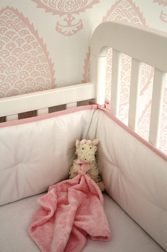
Designing a child’s room involves much consideration of color. Characterized by subtle, soft colors that gradually bleed into the bold and bright, Abby takes the theme of girly pink to another plane. Although the pale pink of the nursery speaks sweet, subtle, and girly, all one must do is glimpse into the bathroom to view soft pink turn into eye-catching fuchsia, and the light blue transform to a bold lava blue background. The wallpaper chosen for the nursery, was hand blocked with an Indian block print in a soft pink tone. This pattern flows beautifully with the soft lines of the white crib, chairs, and cabinetry. The bright fuchsia and blue bathroom wallpaper is dominated by Maharaja characters journeying around the room. The eastern, fun tone of this storied design, complements the overall feeling of the nursery perfectly. The color theme continued with the family’s move to a new home and the redesign of the nursery to “big girl” room.
Creating balance in a room is essential to please both the aesthetics and function of a space. The nursery was a tight space, with limited storage. The family needed places to store clothes and toys, and to change the baby. The solution was built-in cabinetry surrounding the outside wall of the room. Changing table, window seat, dresser, cabinets, and bookshelves were designed to accommodate the practical need for more room without compromising the flow within the nursery. In addition, the design looked toward the future of the nursery. The white paint and window makes the area light and cheerful, despite the small size of the room. The hand-built dresser and changing area around the window was eventually going to morph into a vanity for the girl as she grew. With the move to a new home, however, this conversion never occurred.
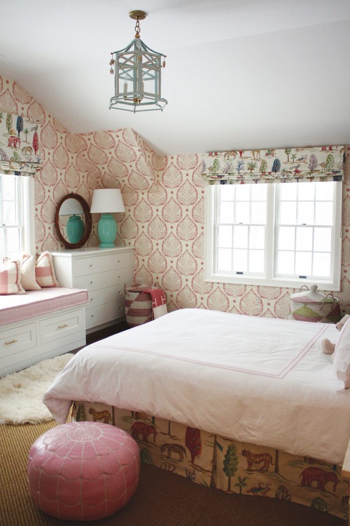
In the “big girl” bedroom Abby brought a brighter, punchier color scheme. If the family had remained at the same home, a change in bedding and accents would have been the primary way to add the flash of new color. As it were, with the family’s move the subtle pink wallpaper was redesigned, and recolored with a brighter, berry color pink. The bedding was changed with accents of bright pink lemonade, but the gentle, soft plush feeling was retained. In addition, curtains with a chic safari theme were chosen to continue the global feel. To add space and openness, a built-in dresser and window seat was created. The window seat can cleverly double as a twin bed for friends to sleepover. The gentle colors of the nursery morphed perfectly to create a more grown-up bedroom that will provide years of joy.
Article edited. Full version available in ONLY NANTUCKET SUMMER 2017.
Find more stories on Nantucket Interior Design

